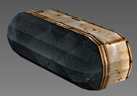
Wednesday, 8 May 2013

My development throughout the project - Atrium

Hey y'all :)

As for me, James Oakes, Jen Betts, our main focus were to create the assets for the level, at this point we were assigned to create assets for the Atrium.

At the start of the project I was making small mistakes which initially I wasn't concerned about  not seeing it as a priority. I soon learnt that, it was a must, when check-listing it, making it 'engine ready'.


Such minor things like;
Centering the coordinates to 0,0,0
Re-seting Xform
Pivot points
Crutch_A:_Asset

So to my assets, the first asset was a crutch that I decided would be relevant to have for our level. Since our timeline was in the 1950's I went for a traditional crutch, which were all wooden, so gathering textures for that wasn't much of a problem and by doing so, I took into consideration the flow of the wood grain, where the direction should properly be place as well as natural degrading.


Crutch_B:_Asset

I decided to create another version of crutches, with a mix of wood and metal. I thought it would be better to have another variation than just one repeating asset everywhere. I do quite like the design of this crutch, with a mix of materials that I had fun when texturing. With each asset I was learning new approaches and techniques to texturing.


Doors_a_Asset

The infamous door, but  these were used for the Atrium to the Ward. They are okay, probably not the best texture in one way, maybe? But what I learnt  when texturing was creating those cracks in the doors giving off that damage illusion. I would probably build more geometry next time, if I created another door, relying on textures and the normal maps, although sometimes this doesn't turn out how you would like it to be. Yet I know I have still got a lot to improve upon and learn :)


Wall_light_A:_Asset

We needed lights for the corridors and areas around the level., so I created these small wall lights, with plastic damage to show some degrade over the years. I realised that back then, they used metal for the shell of the lights, so I kept with that, again I learnt a lot when modelling  even a simple asset such as this, just by being efficient.


 Wall_light_B:_Asset

This light was used for the wards and atrium. I decided to go with another wall light and keeping it traditional by having it all metal. For texturing, I was trying to give a sense of damage, scratched paint and rust. I believe I should have give the light some design/ detail but then again, it is just a simple light for the walls.

I discovered a lot when unwrapping round objects like these, from using different projection in the uvw_unwrap modifier in 3D max, as well as peel, relax, breaking and stitching the UV's a lot more, for which my unwrapping understanding of working it out and placement, has improved.


The Spider

Since coming back from the Easter break I have been working on the spider. Given it was such a large asset I was worried there might not be enough time to get it modeled, unwrapped, textured, rigged and animated. So I've pretty much been working flat out over the last few weeks to get it done.

I started out by working on the concepts in more detail, some of the concepts have already been put up by Meg. I started by modeling in Max first and got quite abit of the head done but was advised it would be better to use Zbrush instead.

So I started it again in Zbrush. I did the head first while Meg started on the body.


Once I finished sculpting the head I made a base model of the leg in Max, then imported it into Zbrush to add details.


I retopologized all the models in Max after I'd finished the sculpts in Zbrush. We had some issues deciding on what the tri budget could be, so I ended up retopoligizing more than once.

Before I started unwrapping the models I did some quick colour concepts to help visualize what the spider might look like.

I then unwrapped the head while Meg unwrapped the body and the leg. Once everything was unwrapped we were able to start on the textures. All the textures were hand painted from scratch using the colour scheme we had selected. We checked the model throughout texturing to make sure it looked suitable and the colours worked well.

Once all the separate sections were completed we put everything together in Max and Megan was able to start working on rigging the spider and animating it.


Tuesday, 7 May 2013

My progress during the group project

My main responsibility as far as the group project was concerned was to contribute to the growing list of assets required for our level. Many of these included simple objects such as a chair or a table but others were more interesting and challenging to model. Underneath I will go over every asset I have produced for the project.

The first asset I made was a a leather bench; decayed and tattered as one might expect out of an abandonned asylum. I decided to design the piece as five seperate assets which may be interchanged or used independantly in order to add variety.

I used my own refference photos along with some free-to-use photoshop brushes I downloaded. I am pleased with the overall effect and feel the piece is successful in its execution.


The second asset(s) I created were a set of doors to be used in the long corridor as well as the examination room. I wanted to ensure reusing the doors wouldnt be noticable, so I made sure not to leave any distinctive markings on their surfaces. I also wanted the reverse side of the padded cell doors to reflect ther interiors and remembered not to include a handle.
 
I am pleased with the end result and I was content with the work I did on the alpha maps to ensure the windows were transluscent. Unfortunately UDK requires alphas to be placed in seperate map channels (which I was unaware of at the time) and editing along with a secondary texture map had to be used once exporting them.

 
I created a fairly simple folding chair to which I made a second variation in which it is in a broken state. It was failry easy to model and texture and I think the end result is good.

 
An asset that gave me a bit of trouble was the nurses desk in which I had to remake once due to not making it long enough in dimensions. The desk is meant to look weathered and derelict, like the environment it is placed in. I decided to warp the door slightly to restrict player access and also to avoid the notion of it being yet another locked door. In fact, locked doors were something we all wanted to avoid whilst designing our level as we understood how frustrating it would be to the player. Instead we tried to think up imaginitive ways of blocking off routes. 


One of the assets I wanted to build for the examination room was the sink; something no surgical environment would be able to function without. I wanted it too look in poor condition and the basin to be very unhygenic. As usual I used my own reference photos which I have edited with brushes. I was also sure to create taps and spouts and position them in the appropriate above the sink.
 
I am pleased with the asset and feel it is one of my better pieces of work.


I produced a table to match the folding chair I made earlier. It was a fairly simple piece to make and it didnt take me very long. I have ensured that I made my assets slightly chunkier than in real life as I wanted the models to look more noticeable.

 
The trolley was also a pretty easy and enjoyable asset to produce. I enjoyed making it look grungy and dirty. I copied the lower shelf as an instance to make the top shelf; in doing so saving on the texture budget.

 
 I thought it would be important to have some form of speaker system in the asylum. Playing a game called "Fatal Frame 4" which dealt with a similar theme and environment had speakers placed in their corridors which resembled the asset I produced. I had to remember to place the picot point in the appropriate area so it could be fitted on the wall.

 
This was another asset I wanted to produce for the examination room. I felt it would be a nice set piece and perhaps offer an insight into what exactly happened in the asylum. The most challenging part was to hand paint the xrays in photoshop. Obviously I couldn't use reference material from online and I didn't have any x-rays handy so using a picture of a skull I found I decided to hand draw it.
 
I feel pleased witht he job I did. I also hope the little easter egg (the spider inside the skull) gets some airtime on the presentation video. This is also the only asset I produced ambient occlusion for.

 
Underneath are some fairly simple, low poly medicine bottles of different shapes and sizes I produced. I wanted their to be a good variety and also a sense of accuracy to them. These were fairly straight forward to make and wasn't too taxing on the texture/triangle budget.


I took alot more care over modelling and texturing the examination table than I had with the folding one. I used reference pictures of an old examination table from the 50's as inspiration and my own reference photos (which I edited) to produce the textures.
 
I am pleased with the end result and feel it works.


The surgical lamp was alot more challenging as at times I wasn't entirely sure how I was going to model it. I used a few reference pictures as guides and also tried to include some of my own ideas. Keeping the trianlge budget to a minimum was also challenging which is what fueled my decision to allow the normal map to define the individual lamps.
 
I feel the lamp does its job but overall isn't of a high enough quality when compared to the previous assets I had produced.


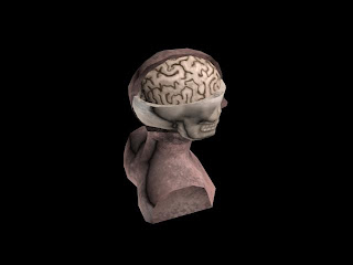
The final and most challenging asset I had to produce was the medical head. Whilst I was comfortable modelling the human side of the model I was pretty lost lost with modelling the skull section. I decided to plane model it but unfortunately managed to stack up quite the tri-count. However I was pleased with the model. The brain itself was just a quarter of an edited sphere.
 
I feel the texturing let down this asset. It was literally the last piece I had to model and was texturing against the clock. However, I think as a representation of something that is meant to be made from plastic it is satisfactory. 


Overally I feel pleased with the work I had produced. There were a few setbacks that might have slowed me down but eventually all the assets (along with new ones appointed to me closer to the deadline) were completed on time. 
 

Bug fixing and the Spider

Once the week was up, it was time to move on to the next level and start refining our environment.

Nikita was given a bug fixing team as it seemed he was having various small problems with some of the teams assets. I thought members of the team would have the perfect opportunity to taster what it would be like to be an outsourcing artist in the industry. Which is a very probable job for a graduate on this course. Nikita as technical artist was to assign suitable tasks to members so that problems could be dealt with swiftly and on a smaller scale.

Meanwhile me (Megan Rice) and Luke Evans got to work on the main queen spider. Luke immediately began refining some of his concepts for the spider and began on making orthrographics for us to model on. As I did some research into some of the problems we might face such as animation, building a non-biped rig and exporting and importing these things.


After Easter


The past couple of weeks have flown by and a lot of progress has been made, not everything has gone according to plan but it would have been foolish to think it would have. The majority of team members have been working really hard, so hard in fact that no one has updated this blog. The week we got back from the Easter holidays we had a catch up presentation in front of two VIP's from Lockwood Studios http://www.lockwoodpublishing.com/ .
I think it went well as the feedback was either good or neutral. Many people seemed excited about our level which was great but adds even more pressure. One thing that was said is that we need to pull the level together and finish of bits and bobs. This matched my own feelings as I felt that over Easter we had lost communication therefore we needed to regroup and each learn what we needed to do for the next week. This is exactly what happened and everyone seemed on board. After this meeting the team had until the end of the week to finish all of there assigned assets on the sheet.


This wasn't a massive issue for most but I feel that some people dragged it out for various reasons.

Tuesday, 26 March 2013

Deadlines Deadlines Deadlines

So its been a while again since my last update, luckily thats because we have all been hard at work.
As team leader I have set a few deadlines in the up and coming weeks. I have been setting deadlines throughout however I feel perhaps I have been to soft before.
My main focus now is to get zones compeleted. I should have stuck to my original plan and not have let my judgement be clouded. The next deadline is for tomorrow I want all assests for zones 1 and 2 textured and ready to import by the end of 22/03/2013. If this is done we should be back on target.
I have also re-structured the way our meetings go about now; as I feel before they were too hap-hazard and certain members were prone to side tracking/railroading the meetings. Now each member must take it in turns tell the group 1.what they have done since the last meeting, 2. they hit the deadline (if not why and how they plan to fix it) 3. What they will be doing in the lab session that day 4. What they have to do for their next deadline.
I find that I have a much better insight now as to how each member works and what pace they are working too. I have flagged those who are lagging in pace and offered help and tutorials.
My main huge deadline is 31/03/2013. Some may feel that this is harsh but I feel like its begining to drag now and I'm a little fed up of the excuses. This deadline is set in stone and gives us five weeks to tweak and make our spiders.
My plan is to have 2 people working on the spider whilst the other 3 fix problems and improve things. Nikita as always will be working with the engine level.
There not much to say about whats going on right now as people are just completing their asigned assests ready for engine. If all goes to plan we have five weeks to fiddle with stuff and build the spider. fingers crossed.

Friday, 22 March 2013

Web Progress

I've been working on the textures for the webs. I figured out how to make brushes from some pictures that I took a while back.
Some of the pictures I used are of webs, others are of some weird dead climbing plants that I thought worked pretty well. All the pictures used to create the brushes are mine.
Heres some example pictures.


I made 5 different textures, all but the 1st are tileable.
I tried to make 2 layers of details, the background is kinda complicated and overworked but meant to be like that to make the web look dense. The top layer has stronger looking strands of webbing.

Heres an example of the textures.


I'm going to upload all the textures onto drop box tonight. I'm also going to try uploading the brushes I've made so that other people can use them to add to their own textures to carry on the webbing theme. Hopefully everyone will find them useful.

I quickly put the textures onto a few models to see how they look. Heres some quick screen shots of that. I tried to make some darker/lighter to mix it up abit.


Hope peeps like them.